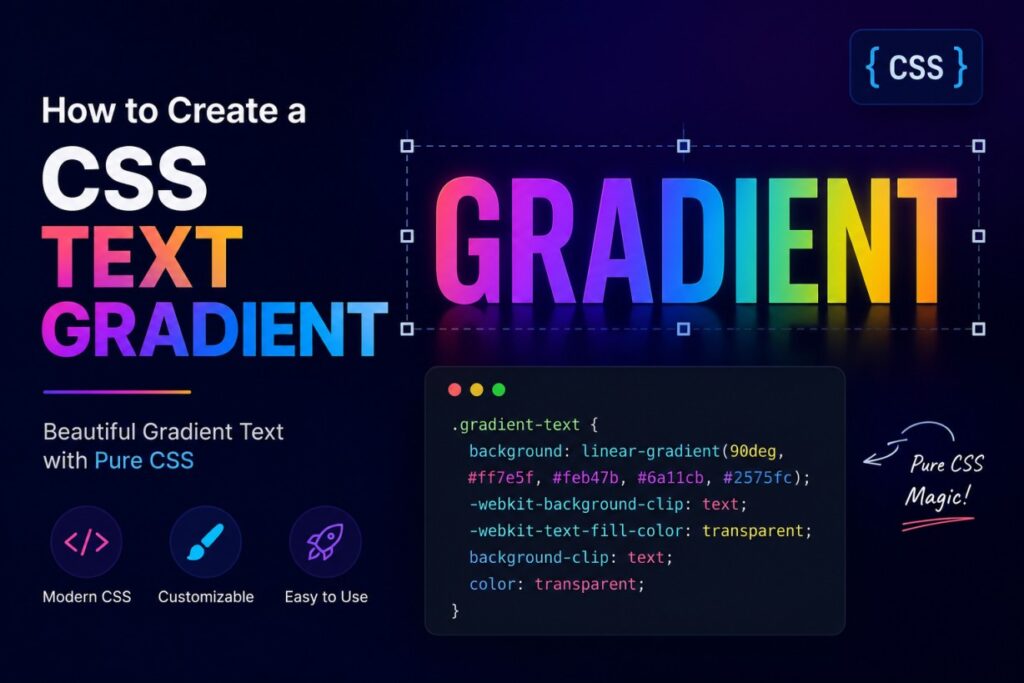
Scroll through any modern website. Within a few seconds, you’ll probably spot a headline where the letters fade from one color into another.
That’s a CSS text gradient. It’s a small effect. But it makes a page feel current instead of dated.
You don’t need a design degree to build one. You don’t need a JavaScript library either. Just a few CSS properties, used correctly.
This guide shows you exactly how gradient text works. You’ll see the different ways to build it, the mistakes people make, and how to skip the manual work with a free generator tool.
What Is a CSS Text Gradient?
Here’s something that trips people up right away: CSS has no text-gradient property. There’s no shortcut like color: gradient(...).
Instead, gradient text is a workaround. Here’s the idea in three steps:
- You apply a gradient as the background of an element.
- You clip that background so it only shows through the shape of the text.
- You make the actual text color transparent.
The result looks like colored text. But technically, it’s a background peeking through invisible letters.
Once you understand that, everything else makes sense.
The Core Technique: background-clip: text
Almost every gradient text effect on the web uses this same method. Here’s the minimal version:
.gradient-text {
  background: linear-gradient(90deg, #ff6ec4, #7873f5);
  background-clip: text;
  -webkit-background-clip: text;
  color: transparent;
  -webkit-text-fill-color: transparent;
}
<h1 class="gradient-text">Design Without Limits</h1>
Let’s break this down line by line.
backgroundsets the gradient. This is what will show through the letters.background-clip: textclips the background to the shape of the text.-webkit-background-clip: textdoes the same job, but for Safari and older Chromium browsers.color: transparenthides the actual text color, so it doesn’t cover the gradient.-webkit-text-fill-color: transparentis Safari’s version of the same idea. Safari sometimes ignores the standard property without it.
Why You Still Need the -webkit- Prefix
You’d expect a technique this common to work without prefixes by now. But background-clip: text has a strange history.
It started as a WebKit-only feature, years before it became a standard property. Safari still leans on -webkit-text-fill-color for full support.
Skip the prefix, and your gradient text may simply not appear for some users. Always include both versions. It’s two extra lines, and it saves you a headache later.
Building Linear Gradient Text
A linear gradient moves color in a straight line. It’s the standard choice for headlines and hero text.
.hero-heading {
  background: linear-gradient(120deg, #f97316, #ec4899, #8b5cf6);
  background-clip: text;
  -webkit-background-clip: text;
  color: transparent;
  -webkit-text-fill-color: transparent;
}
Controlling the Angle
The number before the first color sets the direction. Here’s a quick reference:
0deg— bottom to top90deg— left to right180deg— top to bottom270deg— right to left
You can also use plain words instead of degrees, like to right or to bottom left. Whichever is easier for you to read later.
Adding More Colors
You’re not limited to two colors. Add as many as you want, separated by commas:
background: linear-gradient(90deg, #22d3ee, #6366f1, #ec4899, #f59e0b);
Quick tip: Stick to three or four colors. Beyond that, gradients start to look muddy, especially at smaller text sizes.
Building Radial Gradient Text
A radial gradient spreads color outward from a center point, instead of along a line. It works well on short text, badges, or big numbers.
.radial-text {
  background: radial-gradient(circle, #fde047, #f97316, #7c3aed);
  background-clip: text;
  -webkit-background-clip: text;
  color: transparent;
  -webkit-text-fill-color: transparent;
  font-size: 4rem;
  font-weight: 800;
}
Radial gradients need surface area to show their transition clearly. That’s why they look best on bold, chunky typefaces.
Customizing Your Gradient Text
Adjusting Color Stops
By default, colors space out evenly across the gradient. You can control this manually with percentages:
background: linear-gradient(90deg, #06b6d4 0%, #06b6d4 30%, #8b5cf6 100%);
This holds cyan steady until the 30% mark. Then it transitions into purple for the rest of the way. Use this when you want most of a word in one color, with just an accent fade at the end.
Always Set a Fallback Color
Not every browser supports clipping text like this. If it fails, color: transparent leaves you with invisible text. That’s worse than no gradient at all.
Fix it by adding a solid fallback color before the transparent override:
.gradient-text {
  color: #7c3aed; /* fallback if gradient clipping isn't supported */
  background: linear-gradient(90deg, #06b6d4, #8b5cf6);
  background-clip: text;
  -webkit-background-clip: text;
  -webkit-text-fill-color: transparent;
}
Older or unusual browsers will ignore the properties they don’t understand. They’ll show your fallback color instead of nothing. It’s one line of CSS. It protects your page from looking broken.
Animating a Gradient
The gradient is just a background. That means you can animate it, the same way you’d animate any background image:
.animated-gradient {
  background: linear-gradient(90deg, #06b6d4, #8b5cf6, #ec4899, #06b6d4);
  background-size: 300% 100%;
  background-clip: text;
  -webkit-background-clip: text;
  color: transparent;
  -webkit-text-fill-color: transparent;
  animation: shift 6s ease infinite;
}

@keyframes shift {
  0% { background-position: 0% 50%; }
  50% { background-position: 100% 50%; }
  100% { background-position: 0% 50%; }
}
Enlarging background-size gives the animation room to move. Keep the duration slow, around 5 to 8 seconds. A fast-shifting gradient on text reads as distracting, not polished.
Responsive Considerations
Gradient text mostly behaves like normal text. But a few things are worth watching.
- Short text can lose the effect on small screens. If a headline wraps to one short word on mobile, the gradient barely has room to show. Use
clamp()for font sizing so text stays large enough, or adjust the gradient angle at smaller breakpoints. - Wrapped text can look disjointed. When a heading wraps onto two or three lines, each line clips its own slice of the gradient. This can break up the color transition. Always test at your real breakpoints, not just full-width desktop.
- Skip this effect on long paragraphs. Gradient text is a headline technique. On body copy, it hurts readability and defeats the purpose.
Browser Compatibility
Support is strong across modern browsers. But a few caveats matter.
| Browser | Support Level | Notes |
|---|---|---|
| Chrome | Full support | Unprefixed since Chrome 120; earlier versions need -webkit- |
| Edge | Full support | Same as Chrome (Chromium-based) |
| Firefox | Full support | Unprefixed support since Firefox 49 |
| Safari (desktop) | Full support with prefixes | Requires -webkit-background-clip and -webkit-text-fill-color |
| Safari (iOS) | Full support with prefixes | Same requirements as desktop Safari |
| Older browsers (IE11 and similar) | No support | Falls back to solid text color, if one is set |
Bottom line: always include both background-clip: text and its -webkit- version together. It costs two lines and saves you cross-browser bugs.
Accessibility Considerations
Gradient text looks great. But it comes with real accessibility trade-offs.
- Check contrast on both ends of the gradient. A gradient that fades into a light color can fail contrast requirements, even if the darker end looks fine. Test both ends against your background.
- Don’t gradient your body copy. Save this effect for headlines and short labels. Long-form text needs steady, high-contrast color, especially for readers with low vision.
- Test with a screen reader. The visual effect is purely cosmetic. The underlying text content doesn’t change, so screen readers should read it normally. Still, check it, especially if you’ve wrapped individual letters in
<span>tags. - Respect reduced motion settings. If you animate the gradient, wrap the animation in a media query:
@media (prefers-reduced-motion: reduce) {
  .animated-gradient {
    animation: none;
  }
}
Common Mistakes to Avoid
- Forgetting
color: transparent. Without it, your solid text color sits on top of the gradient and hides it. - Skipping the
-webkit-prefixed properties. This is the top reason gradient text works in Chrome but breaks in Safari. - Using too many colors. More than four stops usually creates a muddy, undefined look.
- Applying gradients to tiny text. Small font sizes don’t leave enough room for a gradient to read as anything but an odd solid color.
- Skipping the fallback color. Without one, unsupported browsers show invisible text instead of something readable.
- Overusing the effect. Gradient text works because it’s an accent. Put it on every heading, and it stops feeling special.
Troubleshooting Gradient Text
| Problem | Likely Cause | Fix |
|---|---|---|
| Text is completely invisible | Missing color: transparent, or a typo in the gradient | Confirm color: transparent is set and check gradient syntax |
| Works in Chrome, not Safari | Missing -webkit- prefixes | Add both -webkit-background-clip: text and -webkit-text-fill-color: transparent |
| Gradient looks flat | Colors too similar, or wrong angle for the text shape | Increase contrast between stops, or try a new angle |
| Gradient cuts off oddly on wrapped text | Each line clips a different slice of the background | Adjust background-size, or use white-space: nowrap on larger screens |
| Text disappears in print or PDF exports | Some print renderers skip background-clip | Add a @media print rule with a solid fallback color |
Pairing Gradients With Text Shadows
Gradient text and shadow effects go well together. A subtle shadow adds depth to a gradient headline, without muddying the color transition. This matters especially on busy background images.
If you want to go deeper on shadows specifically, including multi-layer shadows, glow effects, and neon-style text, read this guide on creating beautiful CSS text shadow effects. It covers the same layering logic in more detail. A lot of polished-looking hero sections are built by combining both techniques: gradient for color, shadow for depth.
Here’s a light-touch example:
.gradient-with-shadow {
  background: linear-gradient(90deg, #06b6d4, #8b5cf6);
  background-clip: text;
  -webkit-background-clip: text;
  color: transparent;
  -webkit-text-fill-color: transparent;
  filter: drop-shadow(0 2px 4px rgba(0, 0, 0, 0.25));
}
Notice the use of filter: drop-shadow() instead of text-shadow. Since the text color is transparent, a standard text-shadow can behave unpredictably on clipped text. drop-shadow() works on the rendered shape instead, which is more reliable here.
How to Generate CSS Text Gradients Without Writing the Code by Hand
Writing gradient CSS by hand is easy once you know the pattern. Picking colors, angles, and stops that actually look good together is a different skill. That part takes trial and error.
If you’d rather preview combinations visually and copy working CSS, use the free CSS text gradient generator. Here’s how it works:
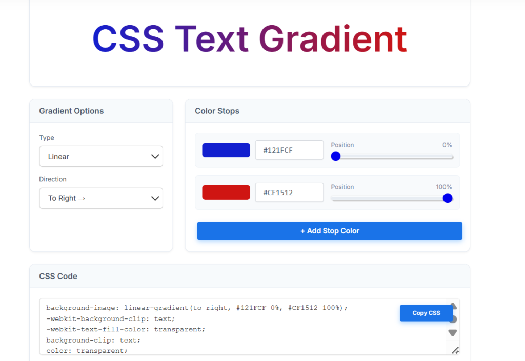
- Pick a gradient type. Choose Linear or Radial from the Type dropdown.
- Set a direction. For linear gradients, pick a direction like “To Right” from the Direction dropdown. This controls the angle of the color transition.
- Choose your first color. Click the color swatch or type a hex code directly (like
#121FCF). Set its position using the slider, from 0% to 100%. - Choose your second color. Do the same for the second stop. Drag its position slider to control where the transition ends.
- Add more colors, if you want. Click + Add Stop Color to add extra colors to the gradient. Each new stop gets its own color and position slider.
- Watch the live preview. The heading at the top updates instantly as you adjust colors, positions, and direction. Use it to fine-tune before you commit to anything.
- Copy the CSS. Once it looks right, click Copy CSS. The tool generates the full snippet, including the
-webkit-prefixed properties, ready to paste into your stylesheet.
That’s it. No manual hex-code guessing, no forgetting the vendor prefix. Just pick colors, preview, and copy.
Frequently Asked Questions
1. Why is my gradient text showing up as a solid color instead of a gradient?
This usually means background-clip: text isn’t being applied. Check for a missing -webkit- prefix, or a missing color: transparent.
2. Can I use CSS text gradients on any font?
Yes. Gradients work with any font. Bolder, larger fonts show the effect more clearly, since there’s more surface area for the color transition.
3. Do CSS text gradients affect SEO?
No. The underlying text and markup don’t change. Search engines read the actual text, not the visual styling on top of it.
4. Is background-clip: text an official CSS standard?
It’s part of the CSS Backgrounds and Borders spec now. But it started as a WebKit-only feature. That’s why the -webkit- prefix is still common alongside the standard property.
5. Can I animate a gradient text effect?
Yes. Since the gradient is a background, you can animate background-position to create a shifting color effect, shown earlier in this guide.
6. Why does my gradient text disappear when I copy and paste it?
It doesn’t. The text content is unaffected by the gradient. Copying strips the CSS styling, which is expected. Styling doesn’t travel with plain text.
7. Should I use gradient text for body paragraphs?
No, generally avoid it. Gradient text works best on headlines, labels, or short accents. Long blocks of gradient text are harder to read and can create contrast issues.
8. What’s the difference between a linear and radial gradient for text?
A linear gradient transitions color along a straight line, in a direction you set. A radial gradient spreads color outward from a center point. Linear works well on longer headlines. Radial works better on short, bold text, like numbers or single words.
Wrapping Up
CSS text gradients come down to one core trick. Clip a background gradient to the shape of your text. Make the text color transparent, so the gradient shows through.
From there, everything else is variation on that same idea: direction, color stops, animation, linear versus radial.
The technique itself is simple. The craft is in restraint. Pick two or three colors that actually complement each other. Keep the effect on headlines, not body copy. Always include a fallback color, so nothing breaks for users on older browsers.
Start small. Try it on one heading. Test it in Chrome, Firefox, and Safari. See how it feels before rolling it out across your whole design.
Once you know the pattern, trying new colors and angles takes minutes, not hours.