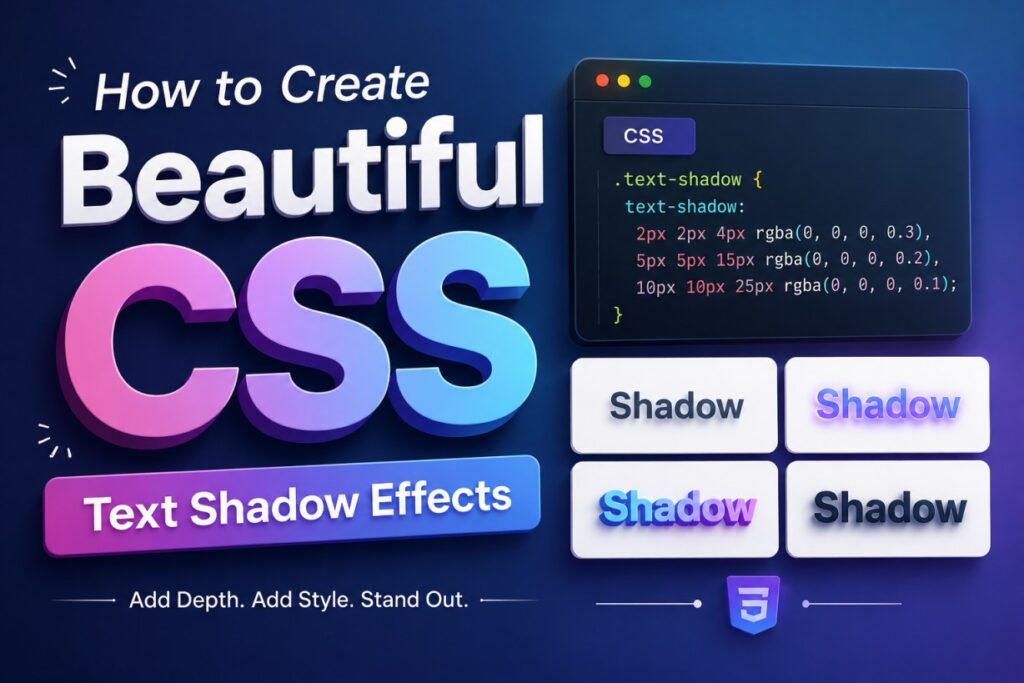
If you’ve ever looked at a website and noticed text that seems to pop off the screen, chances are you were looking at text-shadow in action. It’s one of those CSS properties that looks simple on paper but can completely change the personality of your design when you know how to use it.
In this guide, I’ll walk you through everything you need to know about CSS text shadows — from the basic syntax to advanced layering techniques that create glow, depth, and 3D effects. I’ll also show you a few different ways to build these effects, whether you prefer writing code by hand or using visual tools to speed things up.
Let’s get into it.
What Is text-shadow and Why It Matters
text-shadow is a CSS property that lets you add a shadow (or multiple shadows) behind or around text. On the surface, it seems purely decorative. But used well, it does real work for your design:
- Adds depth — flat text can look dull; a subtle shadow gives it dimension
- Improves readability — a dark shadow behind light text on a busy background can make headlines easier to read
- Reinforces branding — glowing neon text, embossed effects, or soft drop shadows all carry a distinct visual mood
- Draws attention — a well-placed shadow can make a heading or CTA stand out without changing font size or color
Browser support for text-shadow has been solid for years across all major browsers, so you don’t need to worry about fallbacks or vendor prefixes anymore. It just works.
Understanding the text-shadow Syntax
Before jumping into effects, it helps to understand exactly what you’re controlling. The syntax looks like this:
text-shadow: h-offset v-offset blur-radius color;
Here’s what each value does:
- h-offset — how far the shadow moves horizontally. Positive values push it right, negative values push it left.
- v-offset — how far the shadow moves vertically. Positive values push it down, negative values push it up.
- blur-radius — how soft or sharp the shadow edge is.
0gives a crisp shadow; higher numbers blur it out. - color — the shadow’s color, which you can set using hex, RGB, RGBA, or HSL.
A simple example:
h1 {
  text-shadow: 2px 2px 4px rgba(0, 0, 0, 0.4);
}
This pushes the shadow slightly right and down, softens it a bit, and keeps it semi-transparent so it doesn’t look too heavy.
One thing worth remembering: the blur-radius is optional. If you leave it out, the browser treats it as 0, giving you a hard-edged shadow.
Method 1: Writing Text Shadows by Hand
The most straightforward way to add a shadow is to just write the CSS yourself. This works well once you understand how offset direction affects the shadow’s “light source.”
Think of it like real-world lighting. If your light source is above and to the left of the text, the shadow falls below and to the right — which is why positive offset values are so common.
.heading {
  text-shadow: 3px 3px 5px rgba(0, 0, 0, 0.5);
}
A few common mistakes to avoid when doing this manually:
- Too much blur — a blur radius that’s too high makes text look smudged rather than shadowed
- Too little contrast — a shadow that’s nearly the same color as the background barely registers
- Overly dark shadows on light backgrounds — this can look heavy-handed instead of subtle
Start small. A blur of 2–4px and an offset of 1–3px is usually enough for a natural-looking shadow on body text or headings.
Method 2: Layering Multiple Shadows for Advanced Effects
Here’s where text-shadow gets genuinely fun. Unlike box-shadow, you can stack as many shadows as you want on a single element by separating them with commas. Each layer is rendered independently, so you can build up complex effects like glow, embossing, or 3D depth.
Neon Glow Effect
.neon-text {
  color: #fff;
  text-shadow:
    0 0 5px #0ff,
    0 0 10px #0ff,
    0 0 20px #0ff,
    0 0 40px #0ff;
}
This works by layering the same color at increasing blur radii, which mimics how light actually glows outward and fades.
3D / Extruded Text Effect
.text-3d {
  color: #fff;
  text-shadow:
    1px 1px 0 #ccc,
    2px 2px 0 #bbb,
    3px 3px 0 #aaa,
    4px 4px 0 #999,
    5px 5px 5px rgba(0, 0, 0, 0.4);
}
Each layer is offset slightly more than the last with no blur, creating the illusion of depth — like the text has physical thickness.
Embossed / Outlined Effect
.embossed-text {
  color: #ddd;
  text-shadow:
    -1px -1px 1px rgba(255, 255, 255, 0.8),
    1px 1px 1px rgba(0, 0, 0, 0.6);
}
A light shadow on the top-left and a dark shadow on the bottom-right creates a carved, embossed look — similar to text stamped into metal.
Retro Long-Shadow Effect
.retro-text {
  color: #333;
  text-shadow:
    1px 1px 0 #666,
    2px 2px 0 #666,
    3px 3px 0 #666,
    4px 4px 0 #666,
    5px 5px 0 #666,
    6px 6px 0 #666;
}
This was a huge trend in flat design a few years back — a single solid-colored shadow that trails off at a 45-degree angle. You can extend the number of layers to make the “trail” longer.
Method 3: Using Browser DevTools to Experiment
Sometimes the fastest way to fine-tune a shadow is to just play with it live in your browser instead of guessing values and refreshing the page repeatedly.
Here’s the workflow:
- Right-click the text element and choose Inspect
- Find the
text-shadowproperty in the Styles panel - Edit the values directly and watch the text update in real time
- Once you’re happy with it, copy the final value back into your stylesheet
This is especially useful when you’re building layered effects like the neon glow above, since small changes in blur radius can make a big visual difference. Chrome and Firefox both support this kind of live editing out of the box, no extensions needed.
Method 4: Using a Text Shadow Generator Tool
If you’d rather skip the trial-and-error entirely, visual generator tools are a genuinely useful shortcut. Instead of manually adjusting numbers and refreshing your browser, you move sliders for horizontal offset, vertical offset, and blur, pick a color, and watch the preview update instantly. Once it looks right, you copy the generated CSS straight into your project.
This approach is particularly handy when:
- You’re prototyping quickly and don’t want to context-switch into your code editor
- You’re not confident about how blur and offset interact yet
- You want to test several color and blur combinations side by side before committing
One example of this kind of tool is 99Tools’ text shadow CSS generator, which lets you adjust offset, blur, and shadow color with sliders and gives you ready-to-use CSS output that you can copy directly into your stylesheet. It’s a simple way to get a feel for how the property behaves before fine-tuning the code yourself.
Whether you use a tool like this or write the CSS from scratch really comes down to preference — both get you to the same result, just at different speeds.
How to Use a Text Shadow Generator
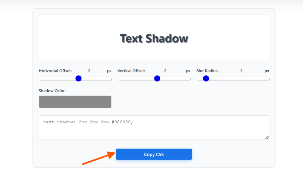
- Open the generator. You’ll usually land on a page with a live text preview and a set of controls below it.
- Adjust the horizontal offset. Drag the slider to move the shadow left or right. Watch the preview update in real time so you can see exactly how far is too far.
- Adjust the vertical offset. This slider controls how far the shadow sits above or below the text — the same real-world “light source” logic from earlier applies here.
- Set the blur radius. Increase this to soften the shadow’s edge, or keep it low for a sharper, more defined look.
- Pick a shadow color. Click the color swatch and choose a color that fits your design — a light gray for subtle depth, or something bolder for a stylized effect.
- Copy the generated CSS. Once the preview looks right, the tool outputs the finished
text-shadowvalue. Click the copy button and paste it straight into your stylesheet.
That’s it. No manual math, no repeated refreshing — just drag, preview, and copy.
Design Tips for Tasteful Text Shadows
Now that you know the how, let’s talk about the how much. Text shadows are easy to overdo, and a heavy-handed shadow can hurt more than it helps.
Prioritize contrast and accessibility
A shadow should never be the only thing making text readable. If your text struggles to pass contrast checks without the shadow, fix the base color first, and treat the shadow as a bonus, not a crutch.
Keep it subtle for body text
Shadows on paragraph text should be nearly invisible — just enough to add a little lift. Save the bold, stylized effects for headlines and hero sections.
Match the shadow to your theme
A soft gray shadow suits a clean, corporate site. A neon glow fits a gaming or entertainment brand. The shadow style should feel like it belongs, not like it was bolted on.
Watch your performance on large blocks of text
A single shadow costs almost nothing to render. But if you’re layering five or six shadows across a huge amount of text (like a full paragraph rather than a heading), it can add unnecessary rendering overhead. Reserve heavy layering for short text like titles and logos.
Real-World Use Cases
Here’s where text shadows tend to show up most often in real projects:
- Hero headings — a soft shadow adds polish to large, bold headline text on landing pages
- Buttons and CTAs — a subtle shadow on button text can make it feel slightly raised and clickable
- Dark mode interfaces — shadows help light text maintain definition against dark backgrounds
- Cards and badges — small text shadows on tags or labels add a bit of visual hierarchy without extra markup
You don’t need to use text-shadow everywhere. Pick a few key spots where it genuinely improves the design, and leave the rest of your text alone.
Frequently Asked Questions
Does text-shadow work with every font and font weight?
Yes. text-shadow is applied at the rendering level, so it works regardless of font family, weight, or size. That said, shadows tend to show up more clearly on bolder, larger text — a thin 12px font with a heavy shadow can end up looking blurry rather than stylish.
Can I animate a text shadow with CSS transitions?
Yes, and it’s a nice touch for hover effects. Since text-shadow is animatable, you can transition between two shadow values:
.link {
  text-shadow: 0 0 0 transparent;
  transition: text-shadow 0.3s ease;
}

.link:hover {
  text-shadow: 0 0 8px rgba(0, 0, 0, 0.4);
}
Keep in mind that transitioning between very different shadow values (like different numbers of layers) doesn’t always animate smoothly, since the browser needs matching shadow “slots” to interpolate between.
What’s the difference between text-shadow and box-shadow?
text-shadow applies specifically to the text characters themselves, following their exact shape. box-shadow applies to an element’s box — its rectangular boundary — regardless of what’s inside it. If you want a shadow that hugs the letters, use text-shadow. If you want a shadow around a container, button, or card, use box-shadow.
Why isn’t my text-shadow showing up?
This usually comes down to one of a few things: the shadow color is too close to the background color, the blur radius is too high and washing the shadow out, or a parent element has overflow: hidden combined with tight spacing that’s clipping it. Double-check contrast first — it’s the most common culprit.
Does using text-shadow affect accessibility or SEO?
Not directly. Screen readers and search engines read the actual text content, not the visual styling, so text-shadow doesn’t impact how your content is indexed or read aloud. The one thing to watch is contrast — if a shadow makes text harder to read for people with low vision, it can hurt usability even though it doesn’t affect SEO.
Can I use text-shadow on text with a gradient or background-clip effect?
It’s tricky. Gradient text is usually created using background-clip: text combined with a transparent text color, and text-shadow doesn’t always render as expected on top of that technique in every browser. If you need both effects together, test across browsers carefully, since support can be inconsistent.
Wrapping Up
CSS text shadows are simple in syntax but surprisingly flexible in what they can achieve — from a barely-there lift on body text to full neon-glow headlines. The four approaches covered here (writing shadows by hand, layering multiple shadows, live-editing in DevTools, or using a visual generator) all lead to the same CSS property; it’s just a matter of which workflow fits how you like to build.
The best way to get comfortable with text-shadow is to experiment. Start with a single subtle shadow, then try stacking a few layers and see how the effect changes. Small adjustments to offset and blur make a bigger difference than you’d expect.